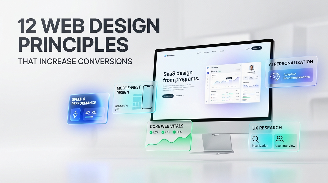
12 Web Design Principles That Actually Increase Conversions in 2026 (Data-Backed)
12 specific, measurable principles — each tied to a real conversion, bounce-rate, or Core Web Vitals number.
Nexovah Staff
63d ago · 12 min read
Key Takeaways
- First impressions form in ~0.05 seconds and are 94% design-driven (Hostinger, 2026).
- A 1-second load delay cuts conversions by 7%; slow load is the #1 reason 88.5% of users leave a site (VWO, 2026).
- Mobile bounce rate (51.8%) runs meaningfully higher than desktop (39.7%) — and poor mobile UX pushes that to 60%.
- Full conversion-architecture redesigns return 41-68% ROI within 6-9 months — far more than cosmetic-only refreshes.
Why Most Web Design Advice Doesn't Move Conversions
Generic web design tips ("simplify the site," "quality over quantity") aren't wrong — they're just unfalsifiable. There's no way to check whether you did them right, because there's no number attached. Real conversion-focused design has numbers attached at every stage: load time, bounce rate, Core Web Vitals pass rate, and post-redesign ROI.
Our finding: The pattern in most underperforming "web design tips" content is that every tip is true but unmeasurable. "Presentation is everything" can't be tested. "Fix your Largest Contentful Paint under 2.5 seconds" can — and Rakuten 24 tested exactly that and saw a 53.37% increase in revenue per visitor.
Take "Know Your Audience," a staple of nearly every generic web design listicle. It's true, but it gives you nothing to check. Compare it to "mobile sessions bounce at 51.8% versus 39.7% on desktop" — that's a number you can pull from your own analytics this afternoon and act on immediately. The rest of this guide is built entirely from that second kind of claim.
The First-Impression Window: You Have 0.05 Seconds
Web design shapes 94% of first impressions, formed in roughly 0.05 seconds — before a visitor reads a single word of copy (Hostinger, 2026). Great UX design can lift conversion rates by up to 400% compared to poor UX, and getting users to view just 10% more content on a session corresponds to a 5.4% increase in conversions (Figma, 2026).
| Stat | What it means |
|---|---|
| 94% | of first impressions are design-driven |
| 0.05s | time to form that impression |
| 88.5% | cite slow load as top reason to leave |
| 7% | fewer conversions per 1-second delay |
12 Web Design Principles That Actually Increase Conversions in 2026
1. Design for the 50-Millisecond Window
Your homepage's above-the-fold area has to communicate legitimacy instantly — clean layout, readable type, and zero visual clutter — because the 0.05-second judgment happens before anyone reads your value proposition. If the first frame looks dated or crowded, the copy underneath never gets read.
2. Fix Core Web Vitals Before Anything Else
Only 47-48% of mobile sites and about 56% of desktop sites currently pass Core Web Vitals, and 43% of sites still fail the 200ms INP (Interaction to Next Paint) threshold — making it the most commonly failed vital in 2026 (Digital ByteTeck, 2026). Pages ranking #1 on Google show a 10% higher Core Web Vitals pass rate than pages sitting at position 9 (Digital ByteTeck, 2026).
| Stat | What it means |
|---|---|
| 47-48% | mobile sites pass Core Web Vitals |
| 56% | desktop sites pass Core Web Vitals |
| 43% | of sites fail the INP threshold |
| +53.37% | revenue/visitor after Rakuten 24's LCP fix |
Our finding: Rakuten 24's A/B test on Largest Contentful Paint is the clearest evidence that speed is a design decision, not just a dev-ops one — a 53.37% revenue-per-visitor increase and 33.13% conversion lift came from a rendering fix, not a redesign.
3. Treat Mobile as the Primary Design Surface, Not an Afterthought
Mobile sessions bounce at 51.8% versus 39.7% on desktop, and poorly optimized mobile sites push bounce rate as high as 60% for the 45% of users who report a bad mobile experience (Loopex Digital, 2026). Designing mobile-first, not mobile-adapted, is the difference between those two numbers.
4. Simplify Navigation Instead of Adding More of It
Every extra navigation item is a decision the visitor has to make before they can act. Reducing choices, not multiplying them, is what "quality over quantity" actually means in practice — fewer, clearer paths to the action you want taken. A menu with 12 top-level items isn't more helpful than one with 5; it just moves the decision fatigue from your team to your visitor.
5. Make Your Purpose Obvious Within the First Scroll
If a visitor can't tell what you do or sell within the first screen, the 94%-first-impression window works against you instead of for you. State the core value proposition in the hero section, not three sections down. This connects directly to the 5.4% conversion lift tied to deeper session engagement — visitors only scroll further to learn more once the first screen has already told them it's worth their time.
6. Treat Accessibility as Infrastructure, Not a Feature
In 2026, accessibility is built into design systems from the start — high-contrast modes, keyboard navigation, reduced motion, and clear language — rather than retrofitted later (Envato Elements, 2026). AI-assisted remediation tools can now instantly fix up to 70% of common WCAG failures, removing the excuse to skip it.
7. Use AI Personalization Where It Measurably Moves Conversions
Personalization delivers double-digit conversion lifts in well-documented cases: e-commerce sites showing returning visitors previously viewed products see conversion lifts of 15-25%, and AI-powered personalization strategies have documented average conversion improvements of 40-60% within 90 days (Veza Digital, 2026). This isn't speculative — it's one of the highest-ROI design investments available in 2026.
8. Add Micro-Interactions That Teach, Not Decorate
Designocracy tested teaching micro-interactions on a signup form and reduced support emails by 22% — users figured out the rules without reading a manual (Designocracy, 2026). A subtle inline hint at the moment of confusion beats a help page nobody opens.
9. Put Trust Signals Above the Fold
Reviews, client logos, security badges, and clear contact information need to appear before a visitor has to scroll to find them — trust has to be established inside the same first-impression window as everything else, not after it. A visitor who has to hunt for proof you're legitimate has usually already decided you're not, well before they find it.
10. Keep the Site Visibly Current
A stale-looking site (outdated dates, dead links, old design patterns) signals risk to a first-time visitor even if the underlying business is thriving. Regular, visible updates are a trust signal as much as a maintenance task — a copyright year stuck three years in the past does more damage to credibility than most visitors consciously realize.
11. Under-Promise in Copy, Over-Deliver in Experience
Setting realistic expectations in your copy and then exceeding them in the actual product or service experience builds the kind of trust that turns a first-time visitor into a repeat customer — this is one of the few genuinely evergreen principles in web design, and it's still true in 2026.
12. Redesign With Conversion Architecture, Not Aesthetics Alone
A cosmetic-only refresh and a strategy-led rebuild produce very different returns. The difference isn't visual polish — it's whether the redesign also touches navigation architecture, form design, page speed, and CTA placement at the same time as the visual refresh, versus treating those as separate, deprioritized work.
| Approach | What's included | Typical timeline | Typical ROI |
|---|---|---|---|
| Cosmetic refresh | New visuals, updated branding, same navigation/forms/CTAs | 4-8 weeks | Often unmeasured or marginal |
| UX-grounded redesign | Visuals + UX research + improved navigation and forms | 6 months | ~41% ROI |
| Full conversion-architecture rebuild | UX research + conversion architecture + Core Web Vitals fixes + SEO foundations | 9 months | ~68% ROI |
What a Website Redesign Actually Returns
A website redesign grounded in user experience and conversion strategy delivers an average 41% ROI within six months, while a full strategy-led rebuild — including UX research, conversion architecture, and SEO foundations — averages 68% ROI within nine months (Bixel Design, 2026). Specific case studies go further: one redesign produced a 60% conversion-rate lift within 90 days, and a retail checkout optimization delivered a 125% increase in checkout conversions with an 18x ROI (Fibr AI; SE Software Tech, 2026).
| Initiative | Reported impact |
|---|---|
| Checkout redesign (case study) | +125% conversions |
| Conversion lift, 90 days (case study) | +60% |
| Strategy-led rebuild ROI, 9 months | 68% |
| UX-grounded redesign ROI, 6 months | 41% |
| AI personalization conversion lift | 15-25% |
The gap between 41% and 68% ROI comes down to scope: redesigns that only touch visuals underperform redesigns that also fix conversion architecture (navigation, forms, page speed, CTA placement) and SEO foundations at the same time.
Common Web Design Mistakes That Quietly Kill Conversions
- Treating speed as a developer problem, not a design one. Every image, animation, and font choice affects Largest Contentful Paint — design decisions and Core Web Vitals outcomes are the same decision made twice.
- Designing desktop-first and "adapting" to mobile. Mobile bounce rates are already structurally higher (51.8% vs 39.7%); designing desktop-first and shrinking it down widens that gap instead of closing it.
- Adding personalization without measuring lift. AI personalization only pays off when it's tested — teams that add "recommended for you" widgets without measuring conversion lift often add page weight without the 15-25% upside that made it worth doing.
- Bolting on accessibility at the end. Retrofitted accessibility is more expensive and less complete than building high-contrast modes, keyboard navigation, and clear language into the design system from day one.
- Chasing visual trends over measured outcomes. A trend-driven redesign (glassmorphism this year, brutalism the next) can look impressive in a portfolio while doing nothing for conversion — none of the case studies in this guide cite a visual trend as the driver of their ROI.
- Launching a redesign without a before/after baseline. If you don't record your current bounce rate, load time, and conversion rate before a redesign, you can't prove the 41-68% ROI range applies to you.
How to Prioritize: A Simple Roadmap for Fixing Your Website
- 1.Audit Core Web Vitals first. If your LCP, INP, or CLS scores are failing, fix those before touching visual design — you're leaking conversions before anyone even judges your aesthetics.
- 2.Fix mobile UX second. With mobile bounce structurally higher than desktop, mobile fixes typically return faster than desktop polish.
- 3.Add trust signals and clarify your purpose third. Cheap to implement, directly targets the 0.05-second first-impression window.
- 4.Layer in AI personalization only after the above are solid. Personalization amplifies a good foundation; it doesn't fix a broken one.
- 5.Commit to a full conversion-architecture redesign, not a cosmetic refresh, when you do rebuild. The ROI gap (41% vs 68%) is the direct cost of stopping at "looks better" instead of "converts better."
Conclusion
The difference between a website that "wows" and one that actually converts is measurability. Every principle here — the 0.05-second first impression, the 51.8% mobile bounce rate, the 43% INP failure rate, the 41-68% redesign ROI spread — is a number you can audit on your own site today. Start with Core Web Vitals, fix mobile UX second, and save the full conversion-architecture rebuild for when you're ready to capture the 68% ROI, not just the 41%.
FAQ
Web design shapes 94% of a visitor's first impression, and that impression forms in roughly 0.05 seconds — before any copy is read (Hostinger, 2026).
Published in The Nexovah Blog
Written by Nexovah Staff